


EXCLUSIVE! Here are the original draft sketches and an alternative cover design for the iconic cover of Warhammer 40,000 Rogue Trader, featuring the last stand of Crimson Fist Space Marines vs Orks
Before creating the cover of 40K Rogue Trader, artist John Sibbick both sketched out an alternative design and the ideas for the final cover. This is a rare glimpse into the process!

In a joint publication by Exploring Warhammer and Original Oldhammer Artwork and with thanks to Alex Read who kindly took the photos from his own impressive collection, we are able to get a peek into some of the process undertaken to create the iconic cover of Warhammer 40,000 Rogue Trader! These draft images were kindly facilitated by Andy Smith of the Original Oldhammer Artwork. The text here is an adaptation of the current draft text for my book project (in block quotes).
Enjoy!
“At that point I made a decision, which I wouldn't make now, because I commissioned out the art, rather than doing the art myself. So you see Rogue Trader has lots of different artists doing different styles.” John Blanche remarked in an interview for this book. John, having created a number of iconic pieces of art for Warhammer Fantasy Battle including the two ‘Harry the Hammer’ covers for 1st and 2nd edition, the cover of the Skeleton Horde minatures boxed set and many more pieces, had, at this point moved into being in the more managerial role as the needs for art to adorn Rogue Trader grew. Indeed John is credited as ‘Art Manager’ in the credits of Rogue Trader itself.
John was keen to use his own experience of being commissioned, to create the right conditions for the art he was now commissioning, “I'll get enthusiastic about it and pass that enthusiasm on hopefully. ... Give them a brief, send them some miniatures. Talk about what the illustration is supposed to do. But you don't make it too prescriptive. You don't do that to creative people. You have to allow their creativity to come out.” John told me that Bryan agreed to this process and, as John knew a lot of people in the freelance art space, they were able to bring in some great talent to the project, “And Bryan was dead enthusiastic, so the contacts I had, like Ian Miller, I knew Ian previous to Games Workshop. So we were enthusiastic about it. Just on a personal level, it was such fun getting people to paint and draw.”
So in the November & December issues of WD 1986 (nos. 83 and 84) players would get to see the results of this process. As noted in this book’s timeline, the new Illuminations section (of White Dwarf) would showcase the work that John and Bryan had commissioned and briefed. The first Illuminations column (WD 83) did not feature 40K but did feature someone who would become an important artist for 40K: Issue 83 started with the work of John Sibbick where it showed his work for the cover of the new Warhammer Fantasy Roleplay and, what would later become, the cover for the first volume of the Realm of Chaos. John Sibbick would go on to create one of the most iconic pieces of 40K art ever - the cover art for 40K Rogue Trader. This seminal work embodied the setting and narrative via its depiction of a group of Crimson Fists Space Marines in a brutal last stand against an out-of-image horde of Orks. The artwork would embody the fatalistic yet defiance of the setting which is “...a dark and terrible era where you will find little comfort or hope.” (As Rick Priestley wrote in 40K Rogue Trader, p.2) The Space Marines, even wounded, continue to relentlessly fight on as the end closes in for them. It is visceral, violent, grim and dark yet has a depicted nobility in the face of death and tells a fragment of a story that the player wants to know more of, indeed, take part in. Despite being set in the far future, for me, it also has echoes of 19th century military art.
In the image, amidst the ongoing combat, we see one marine defiantly raising the chapter flag, as another holds aloft the grim severed head of an Orkish enemy. This grisly trophy being the only direct image of the foe we see despite the intense depiction of combat. Gunfire, explosions and smoke wreath and envelop them. We see little hope they will survive any longer.
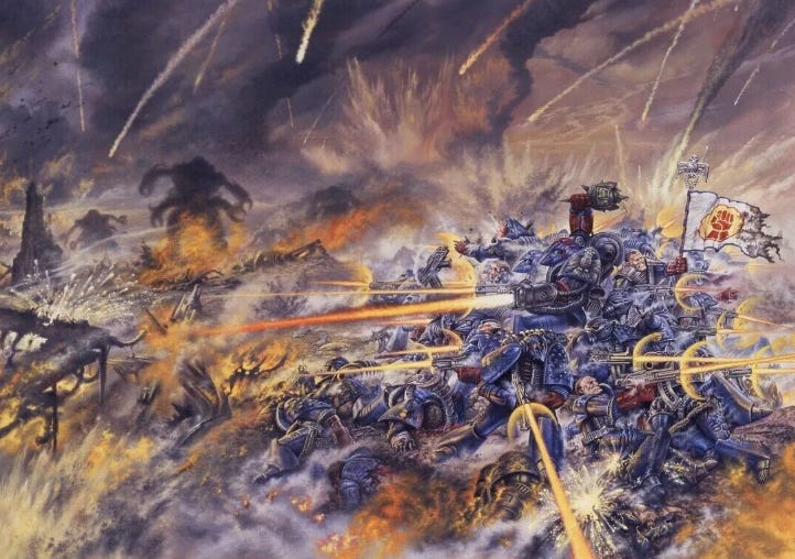
(Image - The cover of 1987’s Warhammer 40,000 Rogue Trader. A game that is still going strong now!)
Like other art developed for Rogue Trader, this had initial sketches done first to establish the framing and composition. These, also by John Sibbick (as sometimes the preliminary sketch work might be by another artist such as Bob Naismith) carry almost all of the elements that would be codified in the final image with minor differences; in the final image the standard bearer is actively shooting his bolter, the shadows of the enemy units are a little more distinct, the ring of marines a little tighter.
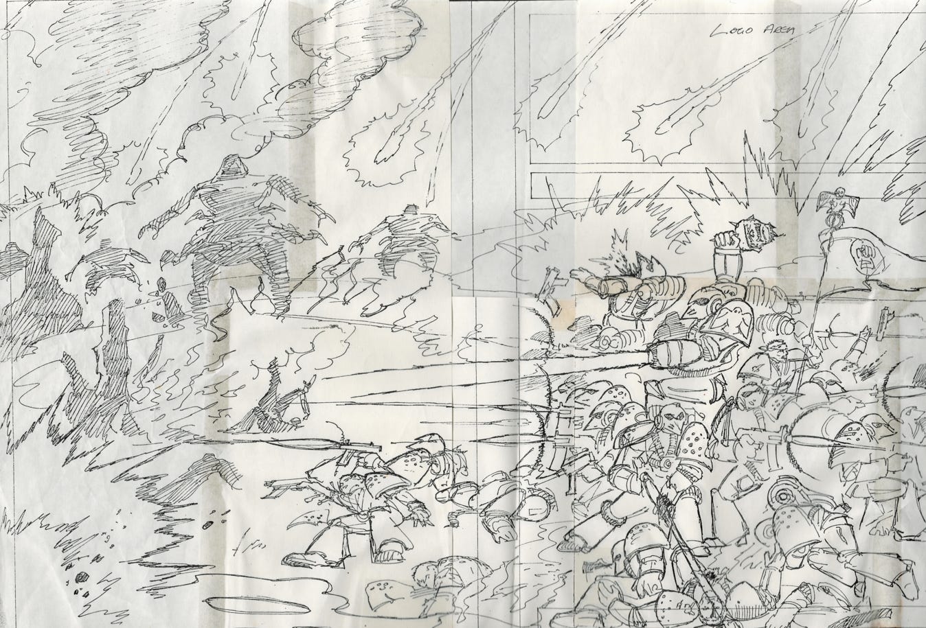
(Image - An initial sketch for the cover of Warhammer 40,000 Rogue Trader, drawn by John Sibbick, image thanks to Alex Read. Image kindly facilitated by Andy Smith of the Original Oldhammer Artwork.)
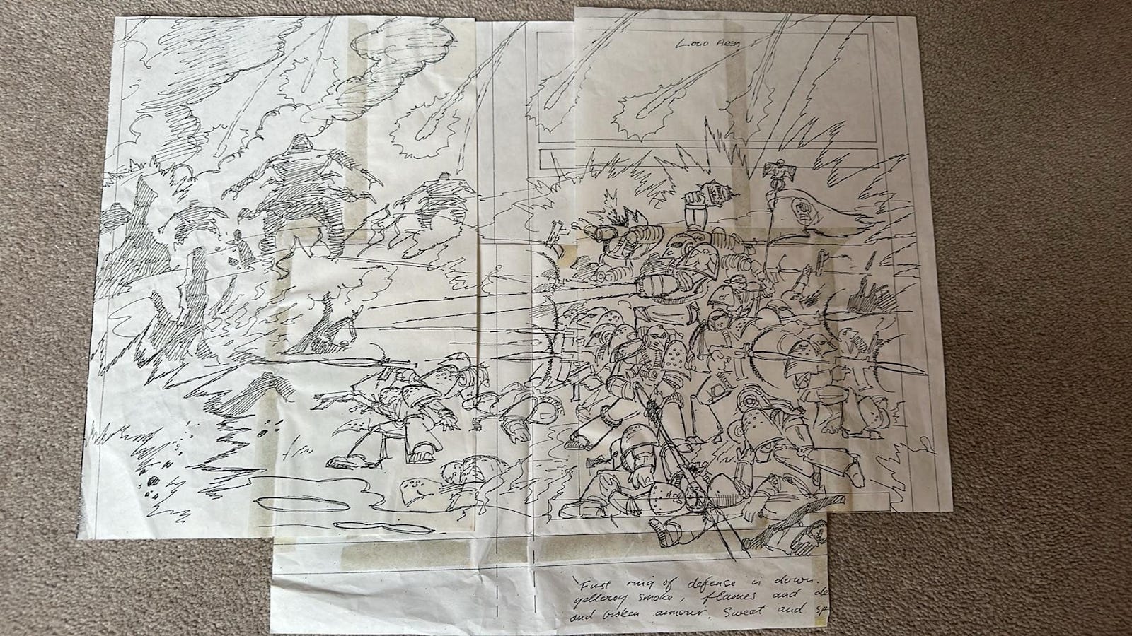
(Image - Another image of initial sketch work for the cover of Warhammer 40,000 Rogue Trader, drawn by John Sibbick, image thanks to Alex Read. Image kindly facilitated by Andy Smith of the Original Oldhammer Artwork.)
The sketches give a few tantalising clues as to the conceptual discussions behind the work, as written on one are these notes [sic];
First ring of defense is down.
yellowy smoke, frames and de [image cut off]
and broken armour. Sweat and sp [image cut off]
Interestingly this image would reverberate within the GW process as well as the enormous impact it had on players such as myself. Bob Naismith, who around a year after the release of 40K Rogue Trader, moved into management of the other miniature designers, when directing fellow designer Kevin Adams in the creation of the Ork dreadnoughts, would reference the shadowy figures to the left of this image. Players would see these in White Dwarf 100, and the designs there referred back to the ionic 40K Rogue Trader cover’s shadowy enemy silhouettes as the basis for the new claw-armed, bulky Ork dreadnoughts.
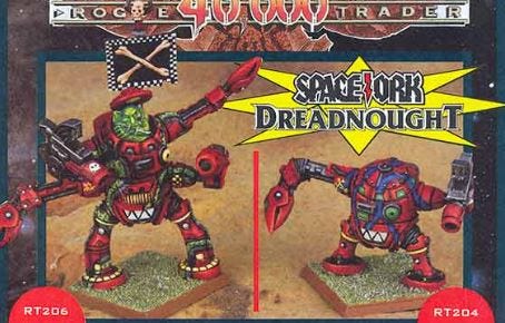
(Image - Rogue Trader era Ork Dreadnoughts. Source)
There was an alternative design for the cover, also by John Sibbick, which depicted a cover that is more close-in combat. Again it is the Crimson Fist Space Marines vs Orks but in this design we clearly see both factions. Foregrounded there is an Ork warrior turning to face the viewer, yelling to off-camera comrades. Midground are the Marines, still with one holding aloft a severed head and another waving the chapter standard. What was one the shadows of the dreadnoughts are now distinct and of a very different design to those that were actually created later on. While there are elements of this alternative design that are interesting and potent, it lacks the uncaring loneliness of the chosen image, it misses the almost certainty of death. What it shows is how key it is to have a piece of seminal emblematic art that summarises the setting for players, even if that image only captures a small part of the wider world - the part it captures says all a potential player needs to see to understand the game.
Many were, like me, hooked on 40K from the time I saw that cover and still am now.
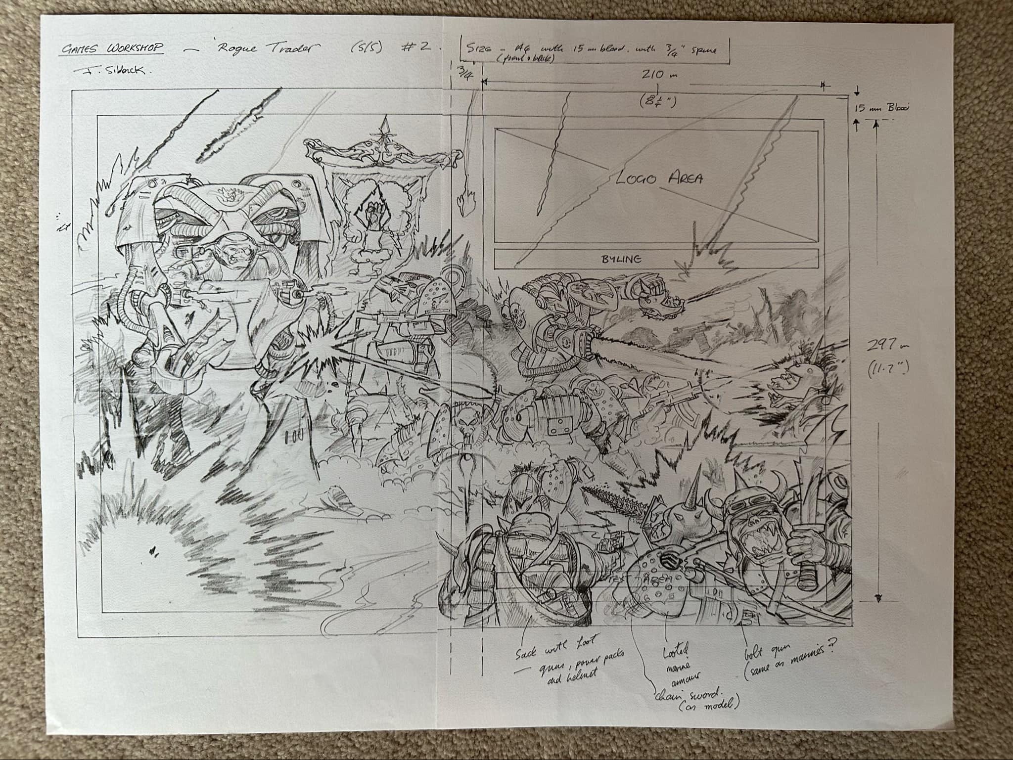
(Image - An alternative cover design for Warhammer 40,000 Rogue Trader, drawn by John Sibbick, image thanks to Alex Read. Image kindly facilitated by Andy Smith of the Original Oldhammer Artwork.)
Thanks for reading!
Note! There is more about this project here. The direct chat for this project is here. You can comment here or find me on BlueSky.
Also note! This book project is a personal one and not affiliated with any company that, in my day job, I work with or partner with.
It's absolutely brilliant to see these pieces explored and dissected so meaningfully. Lovely stuff!
So cool!